Component UI


Color is one of the most crucial tools a designer has since it can make or break a website.
The user will quit your site instantly if it has a terrible color palette but good content. However, if the color palette is nicely picked, the user may give the site a chance.
Before we go into whether color palettes are excellent or bad, let’s define color.
Color is one of the most powerful tools we have as designers, whether we are UI desingers or not. And it has the ability to perform a variety of things for us. It may establish the tone for a brand and attract people’ attention. However, finding the appropriate color combination and then applying those colors to your design might be difficult.
So, how can you include color into your design?
The selection of a color palette and its application to a design are not coincidental. Iteration and careful application are required to fully benefit from and take use of a color in a UI. Color may improve brand impression, capture attention and stimulate interactions, influence user emotions, and increase usability.
Because there are fewer colors to ponder and be distracted by, fewer colors enhance visual hierarchy and contrast.
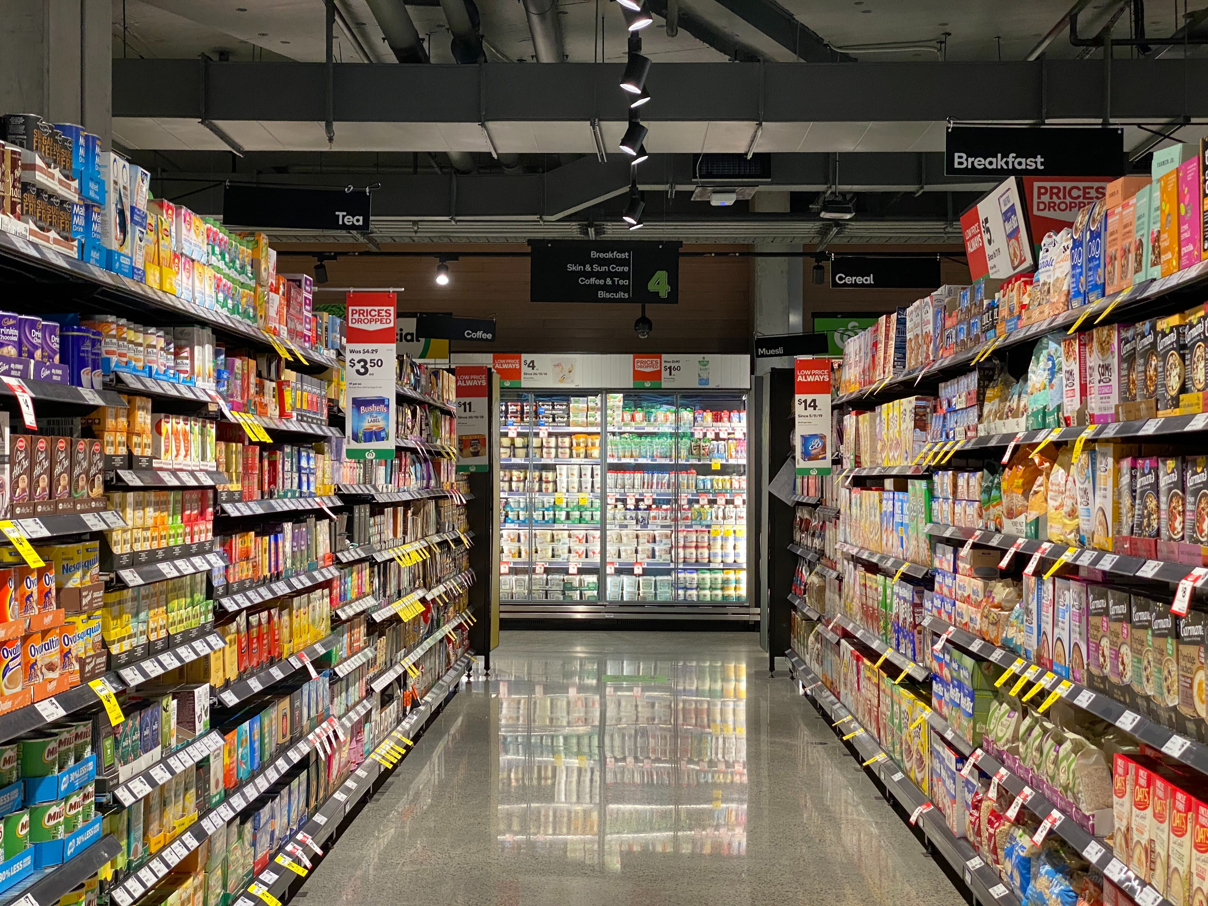
Have you ever struggled to locate a particular cereal in the cereal aisle, for instance? That is as a result of the abundance of colors! Every color is fighting for your attention.
The same is true for your designs.
Less is more.
The 60/30/10 guideline, often known as The Golden Rule, states that color should be utilised 60%, 30%, and 10% of the time. In other words, use 60% for the dominant color, 30% for the secondary color, and 10% for the accent color.
This is more like a style of thinking because it’s impossible to quantify the amount of color you utilize.

The 60% is usually the netral or primary color. This portion will be used as the base color of the design;
The 30% is the secondary color. It is still visible and will be used for some medium components such as card, carousel, etc.;
The 10% is the accent color. This portion will be used for highlight of the design. For example, CTA buton, pop up, and some important points of your interface.;
After applying the 60-30-10 guideline, you’ll need to step back and assess what’s working and what isn’t before making adjustments to your color scheme. Do your color choices help establish the proper visual hierarchy, for example?
In other words, is your attention pulled to the design components you wish to emphasize? Do the colors you’ve chosen help your design have harmony and contrast?

Look for contrast!
Contrast aids in the organization of your design and the establishment of a hierarchy, which simply displays which components of your design are more significant (and signals viewers to focus on those). However, excellent contrast provides visual appeal to your design in addition to underlining the focus point.
A poor contrast might make it difficult to interpret the design.

If your calls to action on one screen are purple, you should use the same color for calls to action everywhere, unless you have an absurdly excellent reason to stray from it.


Component UI
High quality guides created by community for community
Copyright © 2023 ComponentUI. All rights reserved.